Part 2: The Four Survival KPIs
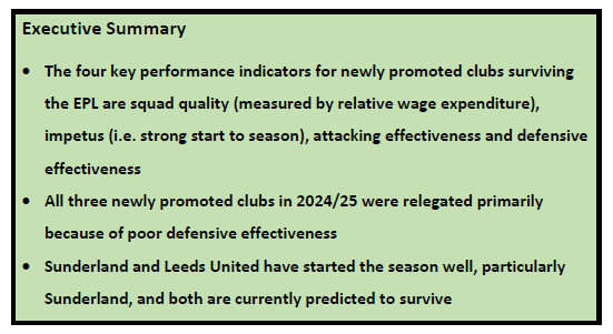
The first part of this two-part consideration of the prospects of newly promoted clubs surviving in the English Premier League (EPL) concluded that the lower survival rate in recent seasons was due to poorer defensive records rather than any systematic reduction in wage expenditure relative to other EPL clubs. It was also suggested that there might be a Moneyball-type inefficiency with newly promoted teams possibly allocating too large a proportion of their wage budget to over-valued strikers when more priority should be given to improving defensive effectiveness. In this post, the focus is on identifying four key performance indicators (KPIs) for newly promoted clubs that I will call the “survival KPIs”. These survival KPIs are then combined using a logistic regression model to determine the current survival probabilities of Burnley, Leeds United and Sunderland in the EPL this season.
The Four Survival KPIs
The four survival KPIs are based on four requirements for a newly promoted club:
- Squad quality measured as wage expenditure relative to the EPL median
- Impetus created by a strong start to the season measured by points per game in the first half of the season
- Attacking effectiveness measured by goals scored per game
- Defensive effectiveness measured by goals conceded per game
Using data on the 89 newly promoted clubs in the EPL from seasons 1995/96 – 2024/25, these clubs have been allocated to four quartiles for each survival KPI. Table 1 sets out the range of values for each quartile, with Q1 as the quartile most likely to survive through to Q4 as the quartile most likely to be relegated. Table 2 reports the relegation probabilities for each quartile for each KPI. So, for example, as regards squad quality, Table 1 shows that the top quartile (Q1) of newly promoted clubs had wage costs at least 79.5% of the EPL median that season. Table 2 shows that only 22.7% of these clubs were relegated. In contrast, the clubs in the lowest quartile (Q4) had wage costs less than 55% of the EPL median that season and 77.3% of these clubs were relegated.
Table 1: Survival KPIs, Newly Promoted Clubs in the EPL, 1995/96 – 2024/25

Table 2: Relegation Probabilities, Newly Promoted Clubs in the EPL, 1995/96 – 2024/25

The standout result is the low relegation probability for newly promoted clubs in Q1 for the Impetus KPI. Only 8% of newly promoted clubs with an average of 1.21 points per game or better in the first half of the season have been relegated. This equates to 23+ points after 19 games. Only 17 newly promoted clubs have achieved 23+ points by mid-season in the 30 seasons since 1995 and only two have done so in the last five seasons – Fulham in 2022/23 with 31 points and the Bielsa-led Leeds United with 26 points in 2020/21.
It should be noted that there is little difference in the relegation probabilities between Q2 and Q3, the mid-range values for both Squad Quality and Attacking Effectiveness, suggesting that marginal improvements in both of these KPIs have little impact for most clubs. As regards defensive effectiveness, both Q1 and Q2 have low relegation quartiles suggesting that the crucial benchmark is limiting goals conceded to under 1.61 goals per game (or 62 goals conceded over the entire season). Of the 43 newly promoted clubs that have done so since 1995, only seven have been relegated, a relegation probability of 16.3%. Reinforcing the main conclusion from the previous post that the main reason that for the poor performance of newly promoted clubs in recent seasons, only four clubs have conceded fewer than 62 goals in the last five seasons – Fulham (53 goals conceded, 2020/21), Leeds United (54 goals conceded, 2020/21); Brentford (56 goals conceded, 2021/22) and Fulham (53 goals conceded, 2022/23) – with of these four clubs, only Fulham being relegated in 2020/21 (primarily due to their poor attacking effectiveness).
Where Did The Newly Promoted Clubs Go Wrong Last Season?
Just as in the previous season 2023/24, so too last season, all three newly promoted clubs – Ipswich Town, Leicester City and Southampton – were relegated. Table 3 reports the survival KPIs for these clubs. In the case of Ipswich Town, their Squad Quality was low with relative expenditure under 50% of the EPL median. In contrast Leicester City spent close to the EPL median and Southampton were just marginally under the Q1 threshold. The Achilles Heel for all three clubs was their very poor defensive effectiveness, conceding goals at a rate of over two goals per game. Only 11 newly promoted clubs have conceded 80+ goals since 1995; all have been relegated.
Table 3: Survival KPIs, Newly Promoted Clubs in the EPL, 2024/25
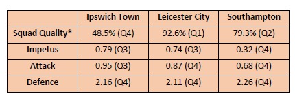
*Calculated using estimated squad salary costs sourced from Capology (www.capology.com)
What About This Season?
As I write, seven rounds of games have been completed in the EPL. Of the three newly promoted clubs, the most impressive start has been by Sunderland who are currently 9th in the EPL with 11 points which puts them in Q1 in terms of Impetus as does their Squad Quality with wage expenditure estimated at 83% of the EPL median, and their defensive effectiveness with only six goals conceded in their first seven games. Leeds United have also made a solid if somewhat less spectacular start with 8 points and ranking in Q2 for all four survival KPIs. Both Sunderland and Leeds United are better placed at this stage of the season than all three newly promoted clubs last season when Leicester City had 6 points, Ipswich Town 4 points and Southampton 1 point. Burnley have made the poorest start of the newly promoted clubs this season with only 4 points, matching Ipswich Town’s start last season but, unlike Ipswich Town, Burnley rank Q2 in both Squad Quality and Attack. Worryingly Burnley’s defensive effectiveness which was so crucial to their promotion from the Championship has been poor so far this season and, at over two goals conceded per game, on a par with Ipswich Town, Leicester City and Southampton last season.
Table 4: Survival KPIs and Survival Probabilities, Newly Promoted Clubs in the EPL, 2025/26, After Round 7
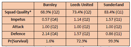
*Calculated using estimated squad salary costs sourced from Capology (www.capology.com)
Using the survival KPIs for all 86 newly promoted clubs 1995 – 2024, a logistic regression model has been estimated for the survival probabilities of newly promoted clubs in the EPL. This model combines the four survival KPIs and weights their relative importance based on their ability to jointly identify correctly those newly promoted clubs that will survival. The model has a success rate of 82.6% predicting which newly promoted clubs will survive and which will be relegated. Based on the first seven games, Sunderland have a survival probability of 99.9%, Leeds United 72.9% and Burnley 1.6%. These figures are extreme and merely highlight that Sunderland have made an exceptional start, Leeds United a good start and Burnley have struggled defensively. It is still early days and crucially the survival probabilities do not control for the quality of the opposition. Sunderland have yet to play a team in the top five whereas Leeds United and Burnley have both played three teams in the top five. I will update these survival probabilities regularly as the season progresses. They are likely to be quite volatile in the coming weeks but should become more stable and robust by late December.