Originally Written: February 2018
Executive Summary
• Effective data analysts need to have great Excel skills; expect 80% of your analytics to be conducted in Excel
• Too often data analysts do not receive enough training on Excel especially at universities, partly because of “software snobbery” and partly because of a lack of appreciation of Excel’s extensive analytical functionality
• The six specific functions in Excel with which every analyst should be very familiar are:
o Pivot Tables
o Custom Sort and Filter
o Conditional Formatting
o Graphics
o Formulas Menu
o Add-Ins
I’ve been asked many times over the years for advice on how to be an effective data analyst. I always stress the importance of having really good relationships with the decision-makers for whom you are working. Always ensure before you start any data analysis that you are clear on how your analysis is going to be used – which decisions is it going to feed into? Analytics after all is analysis with real-world purpose.
The other practical advice I regularly give data analysts is to ensure that you have got great Excel skills. I usually support this with a couple of anecdotes. One is that of an economics graduate with an excellent degree from a well-respected business school who was turned down for a post with a central bank because of a lack of Excel skills. The other is about a meeting I attended that was hosted by the local branch of the OR Society a couple of years ago. Four data analysts were invited to talk about their work experiences. During the Q&A they were asked what they wished that they had done more of at university and all four agreed that they wished they had been taught Excel. They estimated that 80% of their work was done in Excel and only 20% in more specialised software yet all had only been taught how to use specialised statistical software at university. These analysts had gone to different universities and studied different courses but their experiences were common to most data analysts. In part the lack of Excel training at universities is “software snobbery” – it’s sexier to teach more advanced software such as R, SPSS and SAS. But I also think that it is because of a misperception that Excel has limited analytical functionality. Nothing could be wider of the mark. In my own case I use Microsoft Access to store and combine datasets; I use Excel to do the bulk of my data manipulation and analysis; for multiple regression and other advanced statistical techniques I mostly use PC-Give (an econometrics package that I have used for years and which is particularly useful for investigating structural breaks in relationships).
There are many reasons why Excel is so widely used by data analysts. Microsoft Excel and Microsoft Office are so widely available that there are very few organisations that do not operate in a Microsoft environment. Excel is very convenient for basic data preparation. It is easy to import data into Excel, clean it up, transform it as required, and export it to other packages. But Excel has extensive analytical functionality as I will discuss further and can be supplemented by a wide range of add-ins provided by Microsoft and other sources. Excel is particularly suited to analysts who prefer the transparency and flexibility of programming within a spreadsheet environment to meet their specific needs as they arise. If, like me, you prefer to check the output of your programming instantly with a real example then Excel is for you. And, crucially, given that most of your colleagues will have Excel on their PCs, laptops, tablets and mobile devices, it becomes a convenient communication tool. You might find it desirable at times to send your spreadsheets to colleagues. It is quite common for organisations to track their KPIs graphically in dashboards constructed in Excel.
There are six specific functions in Excel with which I think every data analyst should be very familiar and which I use extensively in my own work in sports analytics. The list is by no means comprehensive and I am sure others would consider other Excel functions to be just as important if not more so but these are six Excel functions without which my data analysis for teams would be much more time-consuming and probably much less effective.
1. Pivot Tables
Pivot tables are a very efficient means of combining rows of data and calculating summary statistics. They are particularly useful when you are dealing with large datasets when it could take considerable time to sort the data into sub-groups and then calculate summary statistics for each sub-group. I hate to think of the amount of time I wasted in my early days doing just that in ignorance that the Pivot Table function would do it in seconds. The example below is taken from my season review of the 2014/15 Aviva Premiership. I had a summary row of KPIs for every team in every regular season game. Only 264 rows of data (12 teams x 22 games) but it would have taken several minutes to sort the data for each team and calculate season averages for each team. The Pivot Table below did it all in seconds.
Figure 1: An Example of a Pivot Table

2. Custom Sort and Filter
The Custom Sort and Filter icon in the Home menu is definitely one of my most clicked icons in Excel. The Custom Sort function allows you to order your rows by multiple criteria. I am forever using it to sort team and player performance data which I load as it becomes available but will often want it grouped by team/player and ordered by date. The Filter tool is also very useful. It allows you to select sub-samples of relevant data, again using multiple criteria. Only yesterday I used Filter to extract data on every possession in the Aviva Premiership this season. My full dataset for this season has around 140k rows of data from which I extracted data on 6,550 possessions. It took two clicks to get the possession data using Filter. I copied and pasted it into another spreadsheet and was ready to roll on analysing these possessions. It is also worth remembering that there is a Filter option within Pivot Tables which is particularly useful if you want to analyse different types of sub-samples. Instead of filtering the data to create spreadsheets for each sub-samples and then producing pivot tables, you can work with the initial spreadsheet of data throughout and just filter when you are constructing your pivot tables.
3. Conditional Formatting
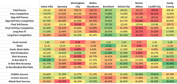
Conditional formatting is a very useful facility available in the Home menu to visualise differences in your data using colours, data bars or a variety of icons include traffic lights and flags. I make very extensive use of colour-coding of KPIs using Conditional Formatting. I have included below an extract from a recent analysis of the EFL Championship. It immediately highlights the tactical differences between teams as regards whether or not they play a possession-based style (e.g. Brentford compared to Burton Albion and Cardiff City), as well as highlighting that Birmingham City and Burton Albion rank poorly in some of the critical shooting KPIs.
Figure 2: Colour-Coding KPIs using Conditional Formatting
4. Graphics
One of the main complaints that I and other users had with the early versions of Excel was that the graphics facility was limited in its options and not user-friendly. I found that once I had created a graphic that did the job, I would go back and just copy and edit it when I needed that type of graphic again. But as data visualisation has become more and more important Microsoft have massively improved the graphics facility in Excel to generate a wide variety of graphics that are easily edited with pull-down menus. On my last count I found 53 basic graphical templates available in Excel. Excel’s graphic facility now has smart functionality. If you highlight the data to be graphed and then click on the Recommended Chart icon in the Insert menu, Excel will identify the most useful graphic templates for your specific data.
5. Formula Menu
The functionality in the Excel Formulas menu is often not fully appreciated. There is so much more available in Excel’s Function Library beyond the extensive array of data analysis functionality in Math & Trig, Statistical (found in More Functions) and Financial. The functionality in Logical and Text can be very powerful for editing textual data.
Figure 3: Excel’s Function Library

6. Add-Ins
Excel comes with some optional functionality in the form of add-ins that need to be loaded via the File menu (select Options, then Add-Ins, then Manage Excel Add-Ins, then tick the boxes for the add-ins you want to load) when first used. There are two add-ins that I use frequently – Data Analysis and Solver. The Data Analysis add-in provides a set of statistical macros that provide an efficient one-stop facility to undertake a number of related statistical functions. Options in Data Analysis include ANOVA (both single factor and two factor versions), Correlation, Regression and t Tests (both for paired and independent samples) amongst many others. The Solver add-in is an optimisation facility which is very useful not only for undertaking standard OR problems but also allows you to construct a variety of more advanced statistical methods such as those using Maximum Likelihood e.g. logistic regression. There are also a variety of “unofficial” add-ins available for Excel. I use several add-ins provided by Conrad Carlberg to accompany his brilliant guides to doing analytics in Excel (see below).
So my basic message to data analysts, both those just starting as well as old-hands, is to regularly explore the functionality of Excel. You will often be surprised as to just how much Excel can do for you. And to educators a plea that you ensure that your students get a good introduction to Excel – it is a basic life skill if you are going to work anywhere that uses data especially if you are going to have any responsibility for managing performance.
Some Further Reading on Excel for Analytics
There are a series of books by Conrad Carlberg providing excellent introductions to analytics using Excel:
Conrad Carlberg, Statistical Analysis: Microsoft Excel 2013, Que, Indianapolis, IN, 2014.
Conrad Carlberg, Decision Analytics: Microsoft Excel, Que, Indianapolis, IN, 2014.
Conrad Carlberg, Predictive Analytics: Microsoft Excel, Que, Indianapolis, IN, 2013.
For a comprehensive coverage of analytical methods using Excel (with excellent appendices on the basics of Excel and Access), try:
J. D. Camm, J. J. Cochran, M. J. Fry, J. W. Ohlmann, D. R. Anderson, D. J. Sweeney and T. A. Williams, Essentials of Business Analytics (2nd edn), Cengage Learning, Boston, MA, 2017.
Extensive but expensive!
