Financial Determinism and the Shooting-Star Phenomenon in the English Premier League

Executive Summary

  • Financial determinism in professional team sports refers to those leagues in which sporting performance is largely determined by expenditure on playing talent
  • Financial determinism creates the “shooting-star” phenomenon – a small group of ”stars”, big-market teams with the high wage costs and high sporting performance, and a large “tail” of smaller-market teams with lower wage costs and lower sporting performance
  • There is a very high degree of financial determinism in the English Premier League
  • Achieving high sporting efficiency is critical for small-market teams with limited wage budgets seeking to avoid relegation

Financial determinism in professional team sports refers to those leagues in which sporting performance is largely determined by expenditure on playing talent. It is the sporting “law of gravity”. Financial determinism implies a strong win-wage relationship with league outcomes highly correlated with wage costs so that those teams with the biggest markets and the greatest economic power (i.e. the biggest “wallets”) to be able to afford the best players tend to win. Financial determinism creates what can be called the “shooting-star” phenomenon shown in Figure 1. The “stars” are the sporting elite in any league, the big-market teams with the high wage costs and high sporting performance. The rest of the league constitutes the “tail”, the smaller-market teams with lower wage costs and lower sporting performance. Some small-market teams can temporarily defy the law of gravity by achieving high sporting efficiency. The classic example of this is the Moneyball story in Major League Baseball where the Oakland Athletics used data analytics to identify undervalued playing talent. And, of course, there are the bigger market teams who spend big but do so inefficiently and perform well below expectation.

Figure 1: The Shooting-Star Phenomenon

A fundamental proposition in sports economics is that uncertainty of outcome is a necessary condition for viable professional sports leagues. This is the notion that the essential characteristic of sport is the excitement of unscripted drama where the outcome is determined by the contest and is not scripted in advance. Uncertainty of outcome requires that teams in any league are relatively equally matched in their economic power with similar revenues and similar access to financial capital. Unequal distribution of economic power across teams leads to financial determinism. The most common causes of disparities in economic power between teams are location (i.e. teams based in large metropolitan areas often have much bigger fanbases and, consequently, can generate much higher revenues) and ownership wealth (i.e. teams with rich owners who are driven by sporting glory rather than profit and will spend whatever it takes to win). To prevent financial determinism, leagues have used a number of regulatory mechanisms to maintain competitive balance including revenue sharing, salary caps and player drafts.

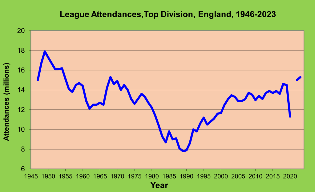
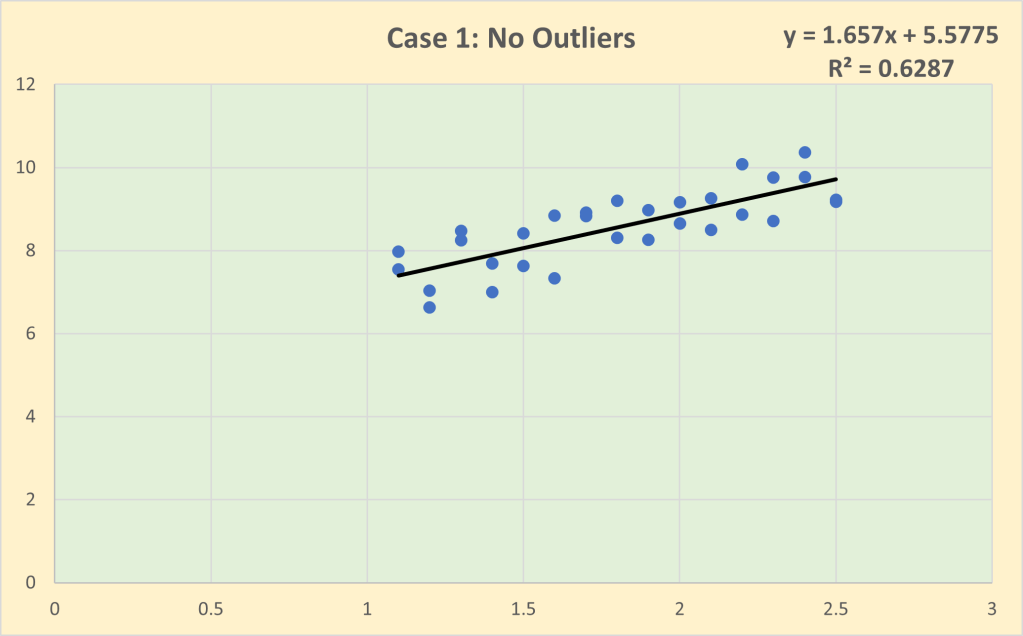
Is the English Premier League subject to financial determinism and the shooting-star phenomenon? To answer this question I have tracked wage costs reported in club accounts from 1995/96 onwards when the English Premier League adopted its current structure of 20 teams and 380 games with three teams relegated. Clubs are still in the process of reporting their 2023 accounts so that the analysis concludes with season 2021/22. Since the analysis covers 27 seasons, wage costs need to be standardised to allow for wage inflation. I have used average wage costs each season to deflate wage costs to 1995/96 levels.  Very roughly, £10m wage costs in 1996/97 equates to £200m wage costs in 2021/22. Sporting performance has been measured by league points based on match outcomes; any point deductions for breach of league regulations have been excluded. (Middlesbrough were deducted 3 points in 1996/97 for failing to fulfil a scheduled fixture and Portsmouth were deducted 9 points in 2009/10 for going into administration.) Figure 2 shows the scatterplot of league points and standardised wage costs. The two groupings, the big-spending stars and the lower-spending tail, are very obvious. The tail is very dense and contains most of the observations (73.9% of the clubs had standardised wage costs under £10m). The stars are fewer in number and more dispersed with 10 instances of clubs having standardised wage costs in excess of £20m (which equates to over £400m in 2021/22). The correlation between standardised wage costs and league points is 0.793 which implies that over the 27 seasons, 62.8% of the variation in league performance can be explained by the variation in wage costs. In other words, there is a very high degree of financial determinism in the English Premier League.

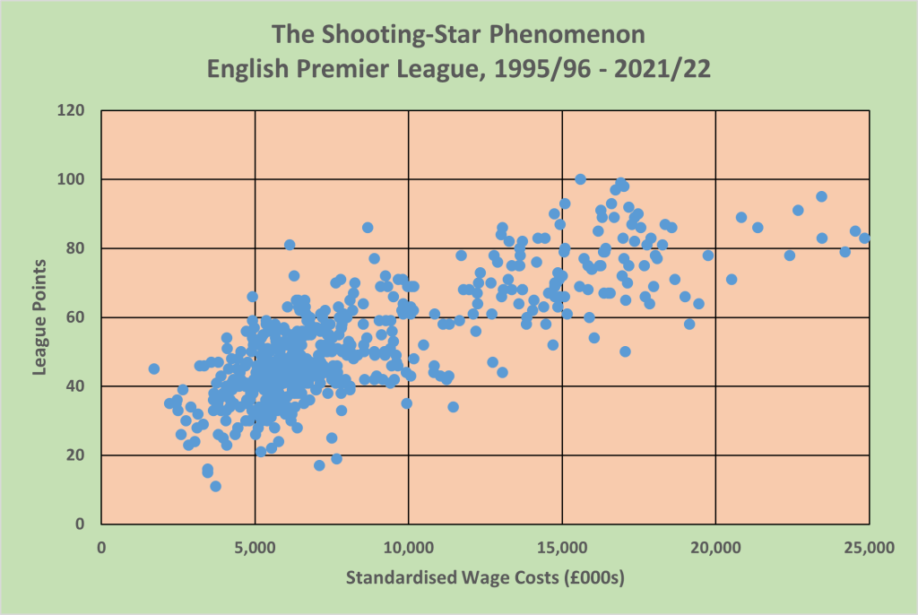
Figure 2: The Shooting-Star Phenomenon in the English Premier League

Season 2021/22 is very typical as regards the degree of financial determinism in the English Premier League as shown in Figure 3. The correlation between wage costs and league points is 0.793 which implies that 61.2% of the variation in league performance can be explained by the variation in wage costs. The linear trendline acts as a performance benchmark – the average efficient outcome for any given level of wage costs – and thus identifies above-average efficient (“above the line”) outcomes and below-average efficient, “below the line” outcomes. At the top end, Manchester City, the champions with 93 points, a single point ahead of Liverpool, were outspent by both Manchester United and Liverpool. Manchester United were highly inefficient gaining only 58 points but with wage costs of £408m. By comparison, West Ham United gained 56 points with wage costs of £136m.

Figure 3: Win-Wage Relationship in English Premier League, 2021/22

As regards relegation, all three relegated teams – Norwich City, Watford and Burnley – lie below the average-efficiency line. In the cases of both Burnley and Watford their final league positions matched their wage rank  – their sporting efficiency was not good enough to offset their resource disadvantage. In contrast, Norwich City allocated enough resource to avoid relegation – their wage costs of £117m ranked 15th – but they were highly inefficient. Of the lower spending teams, the two most efficient teams were Brentford and Brighton and Hove Albion who both finished safely in mid-table but ranked 20th and 16th, respectively, in wage costs. In a future post, I will analyse the determinants of sporting efficiency in more detail.

Read other Related Posts

Measuring Trend Growth

Executive Summary

  • The most useful summary statistic for a trended variable is the average growth rate
  • But there are several different methods for calculating average growth rates that can often generate very different results depending on whether all the data is used or just the start and end points, and whether simple or compound growth is assumed
  • Be careful of calculating average growth rates using only the start and end points of trended variables since this implicitly assumes that these two points are representative of the dynamic path of the trended variable and may give a very biased estimate of the underlying growth rate
  • Best practice is to use all of the available data to estimate a loglinear trendline which allows for compound growth and avoids having to calculate an appropriate midpoint of a linear trendline to convert the estimated slope into  growth rate

When providing summary statistics for trended time-series data, the mean makes no sense as a measure of the point of central tendency. By definition, there is no point of central tendency in trended data. Trended data are either increasing or decreasing in which case the most useful summary statistic is the average rate of growth/decline. But how do you calculate the average growth rate? In this post I want to discuss the pros and cons of the different ways of calculating the average growth rate, using total league attendances in English football (the subject of my previous post) as an illustration.

              There are at least five different methods of calculating the average growth rate:

  1. “Averaged” growth rate: use gt = (yt – yt-1)/yt-1 to calculate the growth rate for each period then average these growth rates
  2. Simple growth rate: use the start and end values of the trended variable to calculate the simple growth rate with the trended variable modelled as yt+n = yt(1 + ng)
  3. Compound growth rate: use the start and end values of the trended variable to calculate the compound growth rate with the trended variable modelled as yt+n = yt(1 + g)n
  4. Linear trendline: estimate the line of best fit for yt = a + gt (i.e. simple growth)
  5. Loglinear trendline: estimate the line of best fit for ln yt = a + gt (i.e. compound growth)

where y = the trended variable; g  = growth rate; t = time period; n = number of time periods; a = intercept in line of best fit

These methods differ in two ways. First, they differ as to whether the trend is modelled as simple growth (Methods 2, 4) or compound growth (Methods 3, 5). Method 1 is effectively neutral in this respect. Second, the methods differ in terms of whether they use only the start and end points of the trended variable (Methods 2, 3) or use all of the available data (Methods 1, 4, 5). The problem with only using the start and end points is that there is an implicit assumption that these are representative of the underlying trend with relatively little “noise”. But this is not always the case and there is a real possibility of these methods biasing the average growth rate upwards or downwards as illustrated by the following analysis of the trends in football league attendances in England since the end of the Second World War.

Figure 1: Total League Attendances (Regular Season), England, 1946/47-2022/23

This U-shaped timeplot of total league attendances in England since the end of the Second World War splits into two distinct sub-periods of decline/growth:

  • Postwar decline: 1948/49 – 1985/86
  • Current revival: 1985/86 – 2022/23

Applying the five methods to calculate the average annual growth rate of these two sub-periods yields the following results:

MethodPostwar Decline 1948/49 – 1985/86Current Revival 1985/86 – 2022/23*
Method 1: “averaged” growth rate-2.36%2.28%
Method 2: simple growth rate-1.62%3.00%
Method 3: compound growth-2.45%2.04%
Method 4: linear trendline-1.89%1.75%
Method 5: loglinear trendline-1.95%1.85%
*The Covid-affected seasons 2019/20 and 2020/21 have been excluded from the calculations of the average growth rate.

What the results show very clearly is the wide variability in the estimates of average annual growth rates depending on the method of calculation. The average annual rate of decline in league attendances between 1949 and 1986 varies between -1.62% (Method 2 – simple growth rate) to -2.45% (Method 3 – compound growth rate). Similarly the average annual rate of growth from 1986 onwards ranges from 1.75% (Method 4 – linear trendline) to 3.00% (Method 2 – simple growth rate). To investigate exactly why the two alternative methods for calculating the simple growth rate during the Current Revival give such different results, the linear trendline for 1985/86 – 2022/23 is shown graphically in Figure 2.

Figure 2: Linear Trendline, Total League Attendances, England, 1985/86 – 2022/23

As can be seen, the linear trendline has a high goodness of fit (R2 = 93.1%) and the fitted endpoint is very close to the actual gate attendance of 34.8 million in 2022/23. However, there is a relatively large divergence at the start of the period with the fitted trendline having a value of 18.2 million whereas the actual gate attendance in 1985/86 was 16.5 million. It is this divergence that accounts in part for the very different estimates of average annual growth rate generated by the two methods despite both assuming a simple growth rate model. (The rest of the divergence is due to the use of midpoint to convert the slope of the trendline into a growth rate.)

              So which method should be used? My advice is to be very wary of calculating average growth rates using only the start and end points of trended variables. You are implicitly assuming that these two points are representative of the dynamic path of the trended variable and may give a very biased estimate of the underlying growth rate. My preference is always to use all of the available data to estimate a loglinear trendline which allows for compound growth and avoids having to calculate an appropriate midpoint of a linear trendline to convert the estimated slope into a growth rate.

Read Other Related Posts

League Gate Attendances in English Football: A Historical Perspective

Executive Summary

  • The historical trends in league gate attendances in English football can be powerfully summarised visually using timeplots
  • Total league attendances peaked in 1948/49 and thereafter declined until the mid-1980s
  • League attendances across the Premier League and Football League have recovered dramatically since the mid-1980s and are now at levels last experienced in the 1950s
  • Using average gates to allow for changes in the number of clubs and matches, the  Premiership matches in 2022/23 averaged 40,229 spectators per match, the highest average gate in the top division since the formation of the Football League in 1888 

How popular are the top four tiers of English league football as a spectator sport from a historical perspective? That’s the question that I want to address in this post using timeplots to visualise the historical trends in gate attendances. I have compiled a dataset with total league attendances for every season since the Football League began in 1888. To ensure as much comparability as possible, I have included only regular-season matches and excluded post-season play-off matches. (A historical footnote – post-season playoffs to decide promotion/relegation are not a modern innovation. There were playoffs called “test matches” in the early years of the Football League after the creation of the Second Division in 1892 but these were abandoned in 1898 and replaced by automatic promotion and relegation following  a scandal when Stoke City and Burnley played out a convenient goalless draw that ensured both would be promoted.)

Total league attendances for the top four divisions are plotted in Figure 1 with three breaks: 1915/16 – 1918/19 due to the First World War, 1939/40 – 1945/46 due to the Second World War and 2020/21 due to the Covid pandemic when all matches were played behind closed doors. In addition, total attendances dropped sharply in 2019/20 due to the final part of the season being postponed and the matches eventually played behind closed doors in the case of the Premier League and Championship, and cancelled entirely in League One and League Two.

Figure 1: Total League Attendances (Regular Season), England, 1888-2023

The Football League started in 1888 with a single division of 12 clubs. Preston North End were the original “Invincibles”, completing the League and FA Cup “Double” unbeaten in the inaugural season. A second division was formed in 1892 and membership of the Football League gradually expanded so that by the outbreak of the First World War in 1914 there were 40 member clubs split equally into two divisions with automatic promotion and relegation between the two divisions. Gate attendances peaked at 12.5 million in the 1913/14 season. The Football League expanded rapidly in the years immediately after the First World War with the incorporation of the Southern League as Division 3 in 1920 and the creation of a Division 3 (North) and Division 3 (South) the following years which increased the membership to 88 clubs by 1923. Total gate attendances reached 27.9 million in season 1937/38.

Gate attendances sharply increased after the Second World War, reaching a record 41.3 million in season 1948/49 which equated to around one million fans attending Football League matches on Saturday afternoons. Although the Football League expanded its membership to its current level of 92 clubs in 1950 and reorganised the two regionalised divisions into Division 3 and Division 4 in 1958, a long-term decline in attendances had set in with attendances falling steadily from the 1950s until the mid-1980s with the exception of a brief reversal of fortune in the late 1960s attributed to a renewed love of the beautiful game after England’s 1966 World Cup victory. The decline bottomed out in 1985/86 when Football League attendances fell to only 16.5 million which represented a 60.0% decrease from the peak in 1948/49. Thereafter the story has been one of continued growth, accelerated in part by the declaration of independence of the top division in 1992 with the formation of the FA Premier League. By last season (2022/23), league attendances in the top four tiers of English football had reached 34.8 million, a level last attained in season 1954/55 – quite an incredible turnaround.

The U-shaped pattern in total league attendances since the end of the Second World War is also evident but less clearly so if we focus only on the top division (see Figure 2). In particular, the post-1966 World Cup effect is much more noticeable with attendances rising from 12.5 million in 1965/66 to 15.3 million in 1967/68 and remaining above 14 million until 1973/74, and thereafter declining to a low of 7.8 million in 1988/89. Interestingly, given that league attendances in the top division account for 40% – 50% of total attendances for the top four divisions, it is somewhat anomalous that the recovery in attendances in the top division seems to have lagged around three years behind the rest of the Football League. However, part of the explanation is the changes in the number of clubs in the top division during that period. There were 22 clubs in the top division from 1919/20 to 1986/87 but this was reduced to 21 clubs in 1987/88 and 20 clubs in 1988/89 before returning to 22 clubs in 1991/92 with the current divisional structure of a 20-club Premier League and three 24-club divisions in the Football League dating from 1995.

Figure 2: League Attendances, Top Division, England, 1946-2023

Given the variations in the number of matches with spectators in the top division across time due to the changes in the number of clubs as well as the effects of the pandemic on total attendances in the 2019/20 season, it is more useful to compare average league gates (see Figure 3). The average gate at top division matches peaked at 38,776 in 1948/49 and declined to a low of 18,856 in 1983/84 (which leads the nadir of total Football League attendances by two years). The rapid growth in Premier League attendances occurred between 1993 and 2003 with the average gate of 21,125 in 1992/93, the first season of the Premier League, increasing by 67.8% over the next 10 years to an average gate of 35,445 in 2002/03. Growth has continued thereafter so that the average gate in the Premier League reached 40,229 in 2022/23, an historical high since the formation of the Football League and 3.7% above the previous record average gate set in 1948/49.

So to answer the question I posed at the start of the post – the top tier of English league football has never been more popular as measured by gate attendances on a per match basis, and the rest of the Football League has a level of popularity not experienced since the 1950s. England has rediscovered its love of the beautiful game since the mid-1980s and not just Premiership football. And that is before considering the explosive growth in TV coverage of English league football both domestically and internationally. But that, as they say, is another ball game entirely.

Figure 3: Average Gate, Top Division, England, 1946-2023

The Problem with Outliers

Executive Summary

  • Outliers are unusually extreme observations that can potentially cause two problems:
    1. Invalidating the homogeneity assumption that all of the observations have been generated by the same behavioural processes; and
    2. Unduly influencing any estimated model of the performance outcomes
  • A crucial role of exploratory data analysis is to identify possible outliers (i.e. anomaly detection) to inform the modelling process
  • Three useful techniques for identifying outliers are exploratory data visualisation, descriptive statistics and Marsh & Elliott outlier thresholds
  • It is good practice to report estimated models including and excluding the outliers in order to understand their impact on the results

A key function of the Exploratory stage of the analytics process is to understand the distributional properties of the dataset to be analysed. Part of the exploratory data analysis is to ensure that the dataset meets both the similarity and variability requirements. There must be sufficient similarity in the data to make it valid to treat the dataset as homogeneous with all of the observed outcomes being generated by the same behavioural processes (i.e. structural stability). But there must also be enough variability in the dataset both in the performance outcomes and the situational variables potentially associated with the outcomes so that relationships between changes in the situational variables and changes in performance outcomes can be modelled and investigated.

Outliers are unusually extreme observations that call into question the homogeneity assumption as well as potentially having an undue influence on any estimated model. It may be that the outliers are just extreme values generated by the same underlying behavioural processes as the rest of the dataset. In this case the homogeneity assumption is valid and the outliers will not bias the estimated models of the performance outcomes. However, the outliers may be the result of very different behavioural processes, invalidating the homogeneity assumption and rendering the estimated results of limited value for actionable insights. The problem with outliers is that we just do not know whether or not the homogeneity assumption is invalidated. So it is crucial that the exploratory data analysis identifies possible outliers (what is often referred to as “anomaly detection”) to inform the modelling strategy.

The problem with outliers is illustrated graphically below. Case 1 is the baseline with no outliers. Note that the impact (i.e. slope) coefficient of the line of best fit is 1.657 and the goodness of fit is 62.9%.

Case 2 is what I have called “homogeneous outliers” in which a group of 8 observations have been included that have unusually high values but have been generated by the same behavioural process as the baseline observations. In other words, there is structural stability across the whole dataset and hence it is legitimate to estimate a single line of best fit. Note that the inclusion of the outliers slightly increases the estimated impact coefficient to 1.966  but the goodness of fit increases substantially to 99.6%, reflecting the massive increase in the variance of the observations “explained” by the regression line.

Case 3 is that of “heterogeneous outliers” in which the baseline dataset has now been expanded to include a group of 8 outliers generated by a very different behavioural process. The homogeneity assumption is no longer valid so it is inappropriate to model the dataset with a single line of best fit. If we do so, then we find that the outliers have an undue influence with the impact coefficient now estimated to be 5.279, more than double the size of the estimated impact coefficient for the baseline dataset excluding the outliers. Note that there is a slight decline in the goodness of fit to 97.8% in Case 3 compared to Case 2, partly due to the greater variability of the outliers as well as the slightly poorer fit for the baseline observations of the estimated regression line.

Of course, in this artificially generated example, it is known from the outset that the outliers have been generated by the same behavioural process as the baseline dataset in Case 2 but not in Case 3. The problem we face in real-world situations is that we do not know if we are dealing with Case 2-type outliers or Case 3-type outliers. We need to explore the dataset to determine which is more likely in any given situation.

There are a number of very simple techniques that can be used to identify possible outliers. Three of the most useful are:

  1. Exploratory data visualisation
  2. Summary statistics
  3. Marsh & Elliott outlier thresholds

1.Exploratory data visualisation

Histograms and scatterplots as always should be the first step in any exploratory data analysis to “eyeball” the data and get a sense of the distributional properties of the data and the pairwise relationships between all of the measured variables.

2.Summary statistics

Descriptive statistics provide a formalised summary of the distributional properties of variables. Outliers at one tail of the distribution will produce skewness that will result n a gap between the mean and median. If there are outliers in the upper tail, this will tend to inflate the mean relative to the median (and the reverse if the outliers are in the lower tail). It is also useful to compare the relative dispersion of the variables. I always include the coefficient of variation (CoV) in the reported descriptive statistics.

CoV = Standard Deviation/Mean

CoV uses the mean to standardise the standard deviation for differences in measurement scales so that the dispersion of variables can be compared on a common basis. Outliers in any particular variable will tend to increase CoV relative to other variables.

3. Marsh & Elliott outlier thresholds

Marsh & Elliott define outliers as any observation that lies more than 150% of the interquartile range beyond either the first quartile (Q1) or the third quartile (Q3).

Lower outlier threshold: Q­1 – [1.5(Q3 – Q1)]

Upper outlier threshold: Q­3 + [1.5(Q3 – Q1)]

I have found these thresholds to be useful rules of thumb to identify possible outliers.

Another very useful technique for identifying outliers is cluster analysis which will be the subject of a later post.

So what should you do if the exploratory data analysis indicates the possibility of outliers in your dataset? As the artificial example illustrated, outliers (just like multicollinearity) need not necessarily create a problem for modelling a dataset. The key point is that exploratory data analysis should alert you to the possibility of problems so that you are aware that you may need to take remedial actions when investigating the multivariate relationships between outcome and situational variables at the Modelling stage. It is good practice to report estimated models including and excluding the outliers in order to understand their impact on the results. If there appears to be a sizeable difference in one or more of the estimated coefficients when the outliers are included/excluded, then you should formally test for structural instability using F-tests (often called Chow tests). Testing for structural stability in both cross-sectional and longitudinal/time-series data will be discussed in more detail in a future post. Some argue to drop outliers from the dataset but personally I am loathe to discard any data which may contain useful information. Knowing the impact of the outliers on the estimated coefficients can be useful information and, indeed, it may be that further investigation into the specific conditions of the outliers could prove to be of real practical value.

The two main takeaway points are that (1) a key component of exploratory data analysis should always be checking for the possibility of outliers; and (2) if there are outliers in the dataset, ensure that you investigate their impact on the estimated models you report. You must avoid providing actionable insights that have been unduly influenced by outliers that are not representative of the actual situation with which you are dealing.

Read Other Related Posts

The Reep Fallacy

Executive Summary

  • Charles Reep was the pioneer of soccer analytics, using statistical analysis to support the effectiveness of the long-ball game
  • Reep’s principal finding was that most goals are scored from passing sequences with fewer than five passes
  • Hughes and Franks have shown that Reep’s interpretation of the relationship between the length of passing sequences and goals scored is flawed – the “Reep fallacy” of analysing only successful outcomes
  • Reep’s legacy for soccer analytics is mixed; partly negative because of its association with a formulaic approach to tactics but also positive legacy in developing a notational system, demonstrating the possibilities for statistical analysis football and having a significant impact on practitioners

There have been long-standing “artisan-vs-artist” debates over how the “the beautiful game” (i.e. football/soccer) should be played. In his history of tactics in football, Wilson (Inverting the Pyramid, 2008) characterised tactical debates as involving two interlinked tensions – aesthetics vs results and technique vs physique. Tactical debates in football have often focused on the relative merits of direct play and possession play. And the early developments in soccer analytics pioneered by Charles Reep were closely aligned with support for direct play (i.e. “the long-ball game”).

Charles Reep (1904 – 2002) trained as an accountant and joined the RAF, reaching the rank of Wing Commander. He said that his interest in football tactics began after attending a talk in 1933 by Arsenal’s captain, Charlie Jones. Reep developed his own notational system for football in the early 1950s. His first direct involvement with a football club was as part-time advisor to Brentford in spring 1951, helping them to avoid relegation from Division 1. (And, of course, these days Brentford are still pioneering the use of data analytics to thrive in the English Premier League on a relatively small budget.) Reep’s key finding was that most goals are scored from fewer than three passes. His work subsequently attracted the interest of Stan Cullis, manager in the 1950s of a very successful Wolves team. Reep published a paper (jointly authored with Benjamin) on the statistical analysis of passing and goals scored in 1968. He analysed nearly 2,500 games during his lifetime.

In their 1968 paper, Reep and Benjamin analysed 578 matches, mainly in Football League Division 1 and World Cup Finals between 1953 and 1967. They reported five key findings:

  • 91.5% of passing sequences have 3 completed passes or less
  • 50% of goals come from moves starting in the shooting area
  • 50% of shooting-area origin attacks come from regained possessions
  • 50% of goals conceded come from own-half breakdowns
  • On average, one goal is scored for every 10 shots at goal

Reep published another paper in 1971 on the relationship between shots, goals and passing sequences that excluded shots and goals that were not generated from a passing sequence. These results confirmed his earlier analysis with passing sequences of 1 – 4 passes accounted for 87.6% of shots and 87.0% of goals scored. The tactical implications of Reep’s analysis seemed very clear – direct play with few passes is the most efficient way of scoring goals. Reep’s analysis was very influential. It was taken up by Charles Hughes, FA Director of Coaching and Education, who later conducted similar data analysis to that of Reep with similar results (but never acknowledged his intellectual debt to Reep). On the basis of his analysis, Hughes advocated sustained direct play to create an increased number of shooting opportunities.

Reep’s analysis was re-examined by two leading professors of performance analysis, Mike Hughes and Ian Franks, in a paper published in 2005. Hughes and Franks analysed 116 matches from the 1990 and 1994 World Cup Finals. They accepted Reep’s findings that around 80% of goals scored result from passing sequences of three passes or less. However, they disagreed with Reep’s interpretation of this empirical regularity as support for the efficacy of a direct style of play. They argued that it is important to take account of the frequency of different lengths of passing sequences as well as the frequency of goals scored from different lengths of passing sequences. Quite simply, since most passing sequences have fewer than five passes, it is no surprise that most goals are scored from passing sequences with fewer than five passes. I call this the “Reep fallacy” of only considering successful outcomes and ignoring unsuccessful outcomes. It is surprising how often in different walks of life people commit a similar fallacy by drawing conclusions from evidence of successful outcomes while ignoring the evidence of unsuccessful outcomes. Common sense should tell us that there is a real possibility of biased conclusions when you consider only biased evidence. Indeed Hughes and Franks found a tendency for scoring rates to increase as passing sequences get longer with the highest scoring rate (measured as goals per 1,000 possessions) occurring in passing sequences with six passes. Hughes and Franks also found that longer passing sequences (i.e. possession play) tend to produce more shots at goal but conversion rates (shots-goals ratio) are better for shorter passing sequences (i.e. direct play). However, the more successful teams are better able to retain possession with more longer passing sequences and better-than-average conversion rates.

Reep remains a controversial figure in tactical analysis because of his advocacy of long-ball tactics. His interpretation of the relationship between the length of passing sequences and goals scored has been shown to be flawed, what I call the Reep fallacy of analysing only successful outcomes. Reep’s legacy to sports analytics is partly negative because of its association with a very formulaic approach to tactics. But Reep’s legacy is also positive. He was the first to develop a notational system for football and to demonstrate the possibilities for statistical analysis in football. And, crucially, Reep showed how analytics could be successfully employed by teams to improve sporting performance.

Competing on Analytics

Executive Summary

  • Tom Davenport, the management guru on data analytics, defines analytics competitors as organisations committed to quantitative, fact-based analysis
  • Davenport identifies five stages in becoming an analytical competitor: Stage 1: Analytically impaired Stage 2: Localised analytics Stage 3: Analytical aspirations Stage 4: Analytical companies Stage 5: Analytical competitors
  • In Competing on Analytics: The New Science of Winning, Davenport and Harris identify four pillars of analytical competition: distinctive capability; enterprise-wide analytics; senior management commitment; and large-scale ambition
  • The initial actionable insight that data analytics can help diagnose why an organisation is currently underperforming and prescribe how its future performance can be improved is the starting point of the analytical journey

Over the last 20 years, probably the leading guru on the management of data analytics in organisations has been Tom Davenport. He came to prominence with his article “Competing on Analytics” (Harvard Business Review, 2006) followed up in 2007 by the book, Competing on Analytics: The New Science of Winning (co-authored with Jeanne Harris). Davenport’s initial study focused on 32 organisations that had committed to quantitative, fact-based analysis, 11 of which he designated as “full-bore analytics competitors”. He identified three key attributes of analytics competitors:

  • Widespread use of modelling and optimisation
  • An enterprise approach
  • Senior executive advocates

Davenport found that analytics competitors had four sources of strength – the right focus, the right culture, the right people and the right technology. In the book, he distilled these characteristics of analytic competitors into the four pillars of analytical competition:

  • Distinctive capability
  • Enterprise-wide analytics
    • Senior management commitment
  • Large-scale ambition

Davenport identifies five stages in becoming an analytical competitor:

  • Stage 1: Analytically impaired
  • Stage 2: Localised analytics
  • Stage 3: Analytical aspirations
  • Stage 4: Analytical companies
  • Stage 5: Analytical competitors

Davenport’s five stages of analytical competition

Stage 1: Analytically Impaired

At Stage 1 organisations make negligible use of data analytics. They are not guided by any performance metrics and are essentially “flying blind”. What data they have are poor quality, poorly defined and unintegrated. Their analytical journey starts with the question of what is happening in their organisation that provides the driver to get more accurate data to improve their operations. At this stage, the organisational culture is “knowledge-allergic” with decisions driven more by gut-feeling and past experience rather than evidence.

Stage 2: Localised Analytics

Stage 2 sees analytics being pioneered in organisations by isolated individuals concerned with improving performance in those local aspects of the organisation’s operations with which they are most involved. There is no alignment of these initial analytics projects with overall organisational performance. The analysts start to produce actionable insights that are successful in improving performance. These local successes begin to attract attention elsewhere in the organisation. Data silos emerge with individuals creating datasets for specific activities and stored in spreadsheets. There is no senior leadership recognition at this stage of the potential organisation-wide gains from analytics.

Stage 3: Analytical Aspirations

Stage 3 in many ways marks the “big leap forward” with organisations beginning to recognise at a senior leadership level that there are big gains to be made from employing analytics across all of the organisation’s operations. But there is considerable resistance from managers with no analytics skills and experience who see their position as threatened. With some senior leadership support there is an effort to create more integrated data systems and analytics processes. Moves begin towards a centralised data warehouse managed by data engineers.

Stage 4: Analytical Companies

By Stage 4 organisations are establishing a fact-based culture with broad senior leadership support. The value of data analytics in these organisations is now generally accepted. Analytics processes are becoming embedded in everyday operations and seen as an essential part of “how we do things around here”. Specialist teams of data analysts are being recruited and managers are becoming familiar with how to utilise the results of analytics to support their decision making. There is a clear strategy on the collection and storage of high-quality data centrally with clear data governance principles in place.

Stage 5: Analytical Competitors

At Stage 5 organisations are now what Davenport calls “full-bore analytical competitors” using analytics not only to improve current performance of all of the organisation’s operations but also to identify new opportunities to create new sustainable competitive advantages. Analytics is seen as a primary driver of organisational performance and value. The organisational culture is fact-based and committed to using analytics to test and develop new ways of doing things.

To quote an old Chinese proverb, “a thousand-mile journey starts with a single step”. The analytics journey for any organisation starts with an awareness that the organisation is underperforming and data analytics has an important role in facilitating an improvement in organisational performance. The initial actionable insight that data analytics can help diagnose why an organisation is currently underperforming and prescribe how its performance can be improved in the future is the starting point of the analytical journey.

Read Other Related Posts

What Can Football and Rugby Coaches Learn From Chess Grandmasters?

Executive Summary

  • Set plays in invasion-territorial team sports can be developed and practiced in advance as part of the team’s playbook and put the onus on the coach to decide the best play in any given match context
  • Continuous open play with multiple transitions between attack and defence puts the onus on the players to make instant ball play and positioning decisions
  • The 10-year/10,000-hours rule to become an expert has been very influential in planning the long-term development of players and derives ultimately from the understanding of the perception skills of chess grandmasters
  • Chess grandmasters acquire their expertise in practical problem-solving by spending thousands of hours studying actual match positions and evaluating the moves made
  • Improved decision-making should be a key learning outcome in all training sessions involving open play under match conditions

Player development in football, rugby and the other invasion-territorial team sports is a complex process. Expertise in these types of sports is very multi-dimensional so that increasingly coaches are moving away from a concentration on just technical skills and fitness to embrace a more holistic approach. The English FA advocates the Four-Corner Model (Technical, Physical, Psychological and Social) as a general framework for guiding the development pathway of all players regardless of age or ability. I prefer to think in terms of the four A’s – Ability, Athleticism, Attitude and Awareness – in order to highlight the importance of decision making i.e. awareness of the “right” thing to do in any given match situation. My basic question is whether or not coaches in football and rugby put enough emphasis on the development of the decision-making skills of players.

Players have to make a myriad of instant decisions in a match, particularly in those invasion-territorial team sports characterised by continuous open play. At one extreme is American football which is effectively a sequence of one-phase set plays that can be choreographed in advance and mostly puts the onus for in-game decision-making on the coaches not the players. The coach writes a detailed script and players have to learn their lines exactly with little room for improvisation. By contrast (association) football is at the opposite end of the spectrum with few set plays and mostly open play with continuous transition between attack and defence; in other words, continuous improvisation. Rugby union has more scope for choreographed set plays at lineouts and scrums but thereafter the game transitions into multi-phase open play. Continuous open play puts the onus firmly on players rather than coaches for in-game decision-making. Players must continuously decide on their optimal positioning as well as making instant decisions on what to do with the ball when they are in possession. This demands ultra-fast expert problem-solving abilities to make the right choice based on an acute sense of spatial awareness.

How can football and rugby coaches facilitate the development of ultra-fast expert problem-solving abilities? One possible source of guidance is chess, an area of complex problem-solving that has been researched extensively and has thrown up important and sometimes surprising insights into the nature of expertise. The traditional view has been that grandmasters in chess are extraordinarily gifted calculators with almost computer-like abilities to very quickly consider the possible outcomes of alternative moves, able to project the likely consequences many moves ahead. But, starting with the pioneering research in the 1950s/60s of, amongst others, De Groot and Herbert Simon, a psychologist who won the Nobel Prize for Economics, we now have a very different view of what makes a grandmaster such an effective problem solver. Four key points have emerged from the research on perception in chess:

  1. Chess grandmasters do not undertake more calculations than novices and intermediate-ability players. If anything grandmasters make fewer calculations but yet are much more able to intuitively select the right move.
  2. The source of expertise of chess grandmasters and masters lies in their ability to recognise patterns in games and to associate a specific pattern with an optimal move. Both De Groot and Simon tested the abilities of chess players of different standards to recall board positions after a very brief viewing. In the case of mid-game positions from actual games with 24 – 26 pieces on the board, masters were able to correctly recall around 16 pieces on their first attempt whereas intermediate-ability players averaged only eight pieces and novices just four pieces. Yet when confronted with 24 – 26 pieces randomly located on the board, there was virtually no difference in the recall abilities between players of different playing abilities with all players averaging only around four pieces correctly remembered. There is a logic to the positioning of pieces in actual games which expert players can appreciate and exploit in retrieving similar patterns from games stored in their long-term memory and identifying the best move. This competitive advantage disappears when pieces are located randomly and, by definition, can never have any relevant precedents for guidance.
  3. Further investigation shows that expert chess players store board positions in their memories as “chunks” consisting of around three mutually related pieces with pieces related by defensive dependency, attacking threats, proximity, colour or type. Since there is a logic to how pieces are grouped in memory chunks, grandmasters tend to need fewer chunks to remember a board position compared to lesser players.
  4. Simon estimated that a grandmaster needs at least 50,000 chunks of memory of patterns from actual games but probably many more and that this would require at least 10 years (or 10,000 hours) of constant practice.

The 10-year/10,000-hours rule to become an expert is now very widely known amongst coaches and indeed has been very influential in planning the long-term development of athletes. Much of the recent popularisation of the 10-year/10,000-hours rule is associated with Ericsson’s work on musical expertise. What is often forgotten is that Ericsson was originally inspired by Simon’s work in chess and indeed Ericsson went on to study under Simon. So our understanding of problem-solving in chess is already having an impact on player development in team sports albeit largely unacknowledged.

Chess grandmasters acquire their expertise in practical problem-solving by spending thousands of hours studying actual match positions and evaluating the moves made. Football and rugby coaches responsible for player development need to ask themselves if their coaching programmes are allocating enough time to developing game-intelligence in open play under match conditions. Not only do players need to analyse the videos of their own decision-making in games but they also need to build up their general knowledge of match positions and the decision-making of top players by continually studying match videos. And this analysis of decision-making should not be limited to the classroom. Improved decision-making should be a key learning outcome in all training sessions involving open play under match conditions.

Note

This post was originally written in June 2016 but never published. It may seem a little dated now but I think the essential insights remain valid. I am a qualified football coach (UEFA B License) and coached for several years from Under 5s through to college level before concentrating on providing data analysis to coaches. I have always considered my coaching experience to have been a key factor in developing effective analyst-coach relationships at the various teams with which I have worked.

The Dismal Science: A Personal Reflection – Part Four

Part 4: The Case For Practice-Led Economics

Executive Summary

  • Economics should be the science of hope in dismal times
  • The essence of mainstream economics is captured by the Robbins conception of economics as the study of the allocation of scarce resources among competing ends
  • All of the limitations of mainstream economics flow directly from conceptualising economic behaviour as rational choice – its de-contextualised universality, the emphasis on formal (mathematical) logic as the principal route to knowledge, the reduction of uncertainty to probabilistic risk, and the inherent laissez-faire presupposition against policy activism
  • The essence of the radical Keynesian approach is the Marshall conception of economics as the study of the everyday business of life
  • Radical Keynesian economics is a pragmatist, practice-led approach, grounded in the reality of everyday human economic behaviour and seeking to develop impact theory that provides practical solutions to real-world problems

I started this series of posts with the proposition that Carlyle’s characterisation of economics as the dismal science could be interpreted in two different ways. The negative interpretation is that economics is dismal in its attachment to a rather Panglossian view that “all is best in the best of all possible worlds” with little to be done by way of policy activism by government beyond regulations to protect the competitiveness of markets. From this perspective, the essence of economics is the invisible hand theorem that the price mechanism can ensure a Pareto-optimal general equilibrium provided that markets are free of structural and informational imperfections. In contrast, the more positive interpretation of economics as the dismal science is that economics tries to understand the world in order to provide ways to improve the well-being of people particularly in dismal times. Economics from this more positive perspective is a source of hope that lives can be made better by appropriate interventions by central government and other agencies. I align myself wholeheartedly with the view that economics should be the science of hope in dismal times.

              Much of the debates about the nature of economics and questions about the legitimacy of mainstream (neoclassical) economics can be summarised as the conflict between two fundamentally different conceptions of economics as a subject, what I will call the Robbins conception and the Marshall conception. In An Essay on the Nature and Significance of Economic Science (1931), Lord Robbins took the view that economics is the study of the allocation of scarce resources among competing ends. In so doing, Robbins rejected previous definitions of the subject matter of economics including that of Alfred Marshall, Professor of Economics at Cambridge. In his Principles of Economics (first published in 1890 and arguably the principal economics textbook for the first half of the 20th Century), Marshall had provided a very different definition that “economics is the study of the everyday business of life”.

The Robbins conception of economics captures the essence of the mainstream approach. Economic behaviour is conceptualised as a series of optimising choices by rational economic agents seeking to maximise their well-being (defined as utility for individuals and profits for firms) while operating as a traders in markets regulated by the price mechanism. All of the limitations of mainstream economics flow directly from this conceptualisation of economic behaviour as rational choice – its de-contextualised universality, the emphasis on formal (mathematical) logic as the principal route to knowledge, the reduction of uncertainty to probabilistic risk, and the inherent laissez-faire presupposition against policy activism.

              Mainstream economics ignores the broader context of human economic behaviour and imposes a universal frame of allocative choice in a market system. It adopts a rationalist, axiomatic approach to knowledge in which all economic behaviour is formalised as some form of constrained optimisation amenable to mathematical modelling. The market system is treated as structurally stable with uncertainty reduced to merely a series of random shocks with a well-defined probability distribution. Seemingly sub-optimal market outcomes are modelled as either optimal equilibrium outcomes under conditions of structural and/or informational imperfections or as disequilibrium outcomes with slow speeds of adjustment towards the optimal equilibrium outcome again due to structural and/or informational imperfections. Imperfectionist theories inevitably provide a weak basis for policy activism and tend to favour a more hands-off, laissez-faire approach by central government and other agencies directed more at market reform to remove the imperfections impeding the operation of the market mechanism.

              In aligning myself with a more radical vision of economics as the science of hope in dismal times, I adopt the Marshall conception of economics as the study of the everyday business of life. This summarises the essence of the radical Keynesian approach. Economics is grounded in the reality of everyday human economic behaviour. It is an inherently pragmatist approach of practice-led economics, what I called “impact theory” in Part 3 of this post. It is the “analytics” approach – analysis for practical purpose; analysis to provide practical solutions to real-world problems. It is an approach that open to the possibility that human economic behaviour is complex with often very different modes of activity that are much deeper than just price-based allocative decisions. Formal mathematical modelling and empirical data analysis both have roles in gaining knowledge just as in every other field of scientific endeavour. But there is a recognition that a pervasive feature of human life is uncertainty – we simple do not know the future. We act in anticipation of the future. Our actions are based on our beliefs, our understanding of the world but always with a recognition that our beliefs are partial understandings and the world is continually changing. And our actions are the product of both reasoned judgment and  emotional response to the specific context in which we find ourselves. Life is a process which we can influence but never full control. Structures change, sometimes suddenly and catastrophically leaving us asking “what is going on here?”, “what should we do?”. It is this pragmatist, practice-led vision of economics as the study of the everyday business of life to which this blog seeks to contribute.

Read Other Related Posts

The Keys to Success in Data Analytics

Executive Summary

  • Data analytics is a very useful servant but a poor leader
  • There are seven keys to using data analytics effectively in any organisation:
  1. A culture of evidence-based practice
  2. Leadership buy-in
  3. Decision-driven analysis
  4. Recognition of analytics as a source of marginal gains
  5. Realisation that analytics is more than reporting outcomes
  6. Soft skills are crucial
  7. Integration of data silos
  • Effective analysts are not just good statisticians
  • Analysts must be able to engage with decision-makers and “speak their language”

Earlier this year, I gave a presentation to a group of data analysts in a large organisation. My remit was to discuss how data analytics can be used to enhance performance. They were particularly interested in the insights I had gained from my own experience both in business (my career started as an analyst in the Unilever’s Economics Department in the mid-80s) and in elite team sports. I started off with my basic philosophy that “data analytics is a very useful servant but a poor leader” and then summarised the lessons I had learnt as seven keys to success in data analytics. Here are those seven keys to success.

1.A culture of evidence-based practice

Data analytics can only be effective in organisations committed to evidence-based practice. Using evidence to inform management decisions to enhance performance must be part of the corporate culture, the organisation’s way of doing things. The culture must be a process culture by which I mean a deep commitment to doing things the right way. In a world of uncertainty we can never be sure that what we do will lead to the future outcomes we want and expect. We can never fully control future outcomes. Getting the process right in the sense of using data analytics to make the effective use of all the available evidence will maximise the likelihood of an organisation achieving better performance outcomes.

2. Leadership buy-in

A culture of evidence-based practice can only thrive when supported and encouraged by the organisation’s leadership. A “don’t do as I do, do as I say” approach seldom works. Leaders must lead by example and continually demonstrate and extol the virtues of evidence-based practice. If a leader adopts the attitude that “I don’t need to know the numbers to know what the right thing is to do” then this scepticism about the usefulness of data analytics will spread throughout the organisation and fatally undermine the analytics function.

3. Decision-driven analysis

Data analytics is data analysis for practical purpose. The purpose of management one way or another is to improve performance. Every data analytics project must start with the basic question “what managerial decision will be impacted by the data analysis?”. The answer to the question gives the analytics project its direction and ensures its relevance. The analyst’s function is not to find out things that they think would be interesting to know but rather things that the manager needs to know to improve performance.

4. Recognition of analytics as a source of marginal gains

The marginal gains philosophy, which emerged in elite cycling, is the idea that making a large improvement in performance is often achieved as the cumulative effect of lots of small changes. The overall performance of an organisation involves a myriad of decisions and actions. Data analytics can provide a structured approach to analysing organisational performance, decomposing it into its constituent micro components, benchmarking these micro performances against past performance levels and the performance levels of other similar entities, and identifying the performance drivers. Continually searching for marginal gains fosters a culture of wanting to do better and prevents organisational complacency.

5. Realisation that analytics is more that reporting outcomes

In some organisations data analytics is considered mainly as a monitoring process, tasked with tracking key performance indicators (KPIs) and reporting outcomes often visually with performance dashboards. This is an important function in any organisation but data analytics is much more than just monitoring performance. Data analytics should be diagnostic, investigating fluctuations in performance and providing actionable insights on possible managerial interventions to improve performance.

6. Soft skills are crucial

Effective analysts must have the “hard” skills of being good statisticians, able to apply appropriate analytical techniques correctly. But crucially effective analysts must also have the “soft” skills of being able to engage with managers and speak their language. Analysts must understand the managerial decisions that they are expected to inform, and they must be able to tap into the detailed knowledge of managers. Analysts must avoid being seen as the “Masters of the Universe”. They must respect the managers, work for them and work with them. Analysts should be humble. They must know what they bring to the table (i.e. the ability to forensically explore data) and what they don’t (i.e. experience and expertise of the specific decision context). Effective analytics is always a team effort.

7. Integration of data silos

Last but not least, once data analytics has progressed in an organisation beyond a few individuals working in isolation and storing the data they need in their own spreadsheets, there needs to be a centralised data warehouse managed by experts in data management. Integrating data silos opens up new possibilities for insights. This is a crucial part of an organisation developing the capabilities of an “analytical competitor” which I will explore in my next Methods post.

Read Other Related Posts